SELF-PROMO POSTER
Step 1: Poster Ideas (Rough Sketches)
For the first individual assignment for this class, we are to make a self-promo poster using Adobe InDesign. I have never heard of Id before until I entered this class. Turns out that InDesign is for Typography purposes. Exactly what we need for this class.First thing to do for this assignment is to come up with 10 ideas for the poster. Our lecturer, Mr Shamsul liked my ideas, and chose 3 out of the 10 for me to move on to the next step with. He chose the first, second, and last idea. I am very happy with Mr Shamsul's reaction as I did not know that he would like my ideas.
Here are the 10 ideas I had:


Step 2: Deciding the Colours for the poster
After deciding which ideas to move on with and eliminating the rest, the next step is to decide on which colours to use for the posters. This is a very tricky part as colours also play a very important part in poster making as the combination of the typography and colours could either be great or terrible, and I am of course aiming for the best combination, which would probably take a lot of tries. Here goes.
Not the best...

Mr.Shamsul likes the typography style of the right one, but not the colour.

Mr.Sham loves the colour of the right one, and he likes the idea of the dotted line, so he asked me to use the dotted line between the words "UNIQUE" and "FUN" from the previous page to separate the words. He also told me to use the colour scheme from the right pic for my final work.

This is the combination of both the right typography and the right colour scheme, but I need to ass dots between UNIQUE and FUN to separate them. Also, Mr.Sham likes the lower right part of the one with the wrong-colour-scheme-pic's typography better than this one's, so he asked me to refer to that pic for the lower right section's typography style.

Good, but not good enough...
And that was all my samples!
Step 3: InDesign Time!!!
It's time for me to use my InDesign skills to make my multimedia version of the poster! Here is my final outcome!!!


Progress...

Almost done...

DONE!!! But wait!!!

More space on the outside? Hmm... A little too much space...
Here, I also changed the colour of the "SOMETIMES".

JUST RIGHT!!! PERFECT!!!
I'm very proud of this as it is my first typography project! Everyone in class loved it when I presented it, including Mr.Sham, and I'm so happy from their reactions.
These 2 posters below are my INSPIRATIONS for the colour scheme of my poster!!!!!!!:

.jpg)
TYPOGRAPHY HANDBOOK
Step
1: Book Cover Ideas (Sketches)
For this assignment, we are required to make a
book. A BOOK!!! I'm going to be an author Oh My Gosh!!! Amazing!!! I am very
excited but at the same time very scared because this is all new to me and I
have no idea how to make an actual legitimate book. But... here goes!
The book we make is going to be about typography,
with the essentials of typography. We will be basing the contents on other
books that we borrow or buy. I bought a book called "Fifty Typefaces that
Changed the World" and I took 10 typefaces from the book as reference.
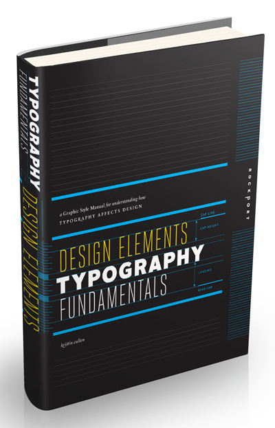
Apart from that, I borrowed a book from my friend and coursemate, Rebecca Tang
too for the front part of the book - the essential anatomy of typography. The
book I borrowed is called "Design Elements: Typography Fundamentals"
by Kristin Cullen. Here are photoes of the books I used as reference:

I made a mood board and put three inspirations for
my handbook too. Here is my moodboard and inspirations:

Individual version:

Mood Board

Inspiration 1

Inspiration 2

Inspiration 3
We all start small, which is to create a book cover
first. Here are my sketches:


Clearer version of my sketches:
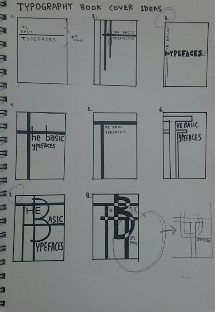


Mr.Sham chose the top right cover(3) and the bottom left cover(7)
Step 2: Colour Ideas For Book Cover
Mr.Sham chose two of the covers he liked best and I went back and, with
the use of my mood board's colour scheme, I coloured in the covers with
different colours in my sketchbook. Here are the photographs of them:

Cover (3)

Cover (7)
When I showed mt coloured sketches to Mr.Shamsul, he still liked both
the cover designs and colours so much that he told me to merge the two designs
together, by using the grid colouring system with different coloured boxes from
the second cover(7) and putting that concept into the first cover(3). From there, I
went back and created a few covers with different colours using the same colour scheme with InDesign. Here
are the jpegs:

(1)

(2)

(3)

(4)

(5)

(7)

(8)
Mr. Sham chose the second cover(2), which is the one with the blue, orange,
and yellow(lightish orange) colour scheme.
Step 3: Pagination
After I am done with the cover design, now it's time for the layout
design within the book - the pagination. I have to plan what goes into which
page, and how many pages I want my book to have, and Mr.Sham said that it's
best if our books have pages (front and back covers included) that can be
divided by 2 to be an even number. For example, 30 pages - divided by 2 is 15 -
is a no, because 15 is an odd number. However, 40 pages - divided by 2 is 20 -
is perfect. And it so happens that in my pagination planning, my book will have
40 pages, but including the index and references will have 44 pages. Here is a
photo of my pagination planning in my sketchbook:


Step 4: InDesign Time!!!
Now that we have planned both the exterior and the interior, it is time
for the actual designing in InDesign! Let's get to it!!!
.
.
.
.
.
.
.
.
.
.
.
.
.
.
.
.
.
.
.
.
.
.
.
.
.
.
.
.
.
.
.
.
.
.
.
.
.
.
.
.
.
.
.
.
.
.
.
.
.
.
.
.
.
.
AND HERE IT IS!!!
Step 4: THE BOOK


I also printed the book out, so it is an actual, real-life, hardcopy of the book. It took a long process to get here, but once you're here, it is an indescribable feeling. You have to experience it for yourself. It's like you've, you're, you, err ... Nope. I just canNOT describe this feeling. But here. Actual proof. I am SO excited!!!


So, ... Did you like the book? If I sold it, would you have bought it? I know that I am very proud of the book because this is the first time I have ever attempted making a book, full with colours and pictures. None of those picture in the book are mine. None of the content are mine too!!! All information of the original owners are in the credit pages in my book. Design of the book is mine though, but I still did research and have inspirations, as seen in the mood board I posted previously.
That's all for this assignment. Thanks so much for sticking with me until the end of my post!!! This has been an amazing journey with you!!!!!! Until we meet next semester!!!
From the Front cover all the way to the Back cover. All 54 pages!!!


I also printed the book out, so it is an actual, real-life, hardcopy of the book. It took a long process to get here, but once you're here, it is an indescribable feeling. You have to experience it for yourself. It's like you've, you're, you, err ... Nope. I just canNOT describe this feeling. But here. Actual proof. I am SO excited!!!


So, ... Did you like the book? If I sold it, would you have bought it? I know that I am very proud of the book because this is the first time I have ever attempted making a book, full with colours and pictures. None of those picture in the book are mine. None of the content are mine too!!! All information of the original owners are in the credit pages in my book. Design of the book is mine though, but I still did research and have inspirations, as seen in the mood board I posted previously.
That's all for this assignment. Thanks so much for sticking with me until the end of my post!!! This has been an amazing journey with you!!!!!! Until we meet next semester!!!
OTHER EXERCISES ALONG THE WAY
Hello again people!!!
During y journey in this class and along the way of doing assignments 1 and 2, we also had little exercises in between those assignments. I did not manage to save some of those exercises as my USB pendrive died on me 3/4 through the semester before I managed to transfer all my exercise files to my laptop, as I use the MacLab in campus to do these exercises and later transfer them to my USB then to my laptop. But here are those that I managed to save.
Layout Design
This is basically kind of like pagination. Mr.Sham taught us this so that we will know the basics on how to make a newsletter and/or the insides of a book. He taught us this before we did the pagination of out typo handbook.
This is the inspiration he gave us in Taylor's Portals:


Exercise Week 9 - Clipping Mask and Layers
This is another exercise I managed to salvage and find. It's just a small ungraded exercise where Mr.Shamsul taught us about the layers in a page and how to use the clipping mask, much like in Photoshop and Illustrator. One new thing I learned was that in InDesign, there are 2 techniques to insert a picture, one is a very difficult technique using the pen tool (the sandals) and another technique is using the clipping path(chair). For the one using the pen tool, once you did it, you cannot change the side or position of the image anymore or it will go out of frame. But it is a cleaner way then the clipping path way.
In this jpeg, I did not manage to finish the pages because class finished before I was able to, but this was just a small ungraded exercise and a lesson to take notes of, so we did not need to finish it.


During y journey in this class and along the way of doing assignments 1 and 2, we also had little exercises in between those assignments. I did not manage to save some of those exercises as my USB pendrive died on me 3/4 through the semester before I managed to transfer all my exercise files to my laptop, as I use the MacLab in campus to do these exercises and later transfer them to my USB then to my laptop. But here are those that I managed to save.
Layout Design
This is basically kind of like pagination. Mr.Sham taught us this so that we will know the basics on how to make a newsletter and/or the insides of a book. He taught us this before we did the pagination of out typo handbook.
This is the inspiration he gave us in Taylor's Portals:

And... This is what I did:) My very first newsletter!!! (Page by page)


This is another exercise I managed to salvage and find. It's just a small ungraded exercise where Mr.Shamsul taught us about the layers in a page and how to use the clipping mask, much like in Photoshop and Illustrator. One new thing I learned was that in InDesign, there are 2 techniques to insert a picture, one is a very difficult technique using the pen tool (the sandals) and another technique is using the clipping path(chair). For the one using the pen tool, once you did it, you cannot change the side or position of the image anymore or it will go out of frame. But it is a cleaner way then the clipping path way.
In this jpeg, I did not manage to finish the pages because class finished before I was able to, but this was just a small ungraded exercise and a lesson to take notes of, so we did not need to finish it.


And there you go:)
No comments:
Post a Comment