FIRST CLASS OF THE SEMESTER
Photoshop Exercise
For my first exercise, I am to do a simple masking exercise for Photoshop. The class voted on Harry Hart from Kingsman to photoshop. Here is my product:)
CARICATURE
Assignment 1 - Adobe Illustrator
Next up, an assignment! I have to us Adobe Illustrator to make a caricature of myself. Here is my progress throughout the process:I selected a photo from my phone album to draw and exaggerate of myself. But the first drawing I did was not up to my expectations, so I drew another one, which was the one that I decided to choose to make in digital form using Ai.

The first drawing, that I decided not to use.

My second drawing - the one that I used for my caricature on Ai.
Here is the process of my using the pen tool on Ai to make the digitalized version of my caricature:

First, I outlined the drawing.

Then, I filled each part in with a solid colour.

Later on, I added details to the hair, and also the eyes.

Later on, I added details on the other parts of the drawing, such as the clothing and skin.
I also added shading to the hair too.

Lastly, I added a colourful background using the mesh tool.

This is another colourful background that is slightly different than the previous one.
TINY PIXELATED HUMANS
Pixel Art Using Adobe Photoshop
For this exercise, we were paired with a classmate randomly, and we have to create a pixel art of our partners.
Yasmin was my partner, and so I went ahead and created a pixel art of her. I am quite proud of my first pixel art, as I had never ventured into pixelation territory before.

This is Yasmin. My partner for this assignment:)
She's wearing all black, that is quite a challenge for me.
A not-even-halfway-done pixel form of Yasmin.
The final version of Yasmin's pixelness!!!
This is the template the lecturer gave to us to start off with our pixeling journey:

He's called Buddy, apparently...
Well, that's all for now!!! See you on my next lesson! I wonder what we'll learn next...
WORD with CHARACTERISTICS
CUTE : Adobe Illustrator
For this exercise, each of us had to choose one word, and from that word, make it with the characteristic of the chosen word. For example, the word that I have chosen is "CUTE", therefore, I have to make my word look cute. My definition of cute comes in many types, but I had an inspiration to use cute animals to give character to my word, so I set out making my word out of cute animals. Here are some of my sketches:


My first sketch:) I was pretty proud of it until Mr.Jeffrey pointed out that the turtle and walrus did not look happy. So, I tried to change the position of the turtle, as seen at the bottom part of the page here.

In this page, I tried to change both the walrus and the turtle into different animals, but it did not work out for me as the whale looks a bit weird, mostly because it's so much smaller than the fox, and it annoys me. I liked the fox, but in order for the fox to be there, the whale has to be there too as the fox is stretching its hands out to touch the water droplets that the whale sprayed. I also did not like the seal for the letter "E" as it doesn't really look like an "e" nor an "E". So, I scratched the ideas.
I thought of stacking the turtles and somehow making them into the letter "E", so I experimented on various positions:

Turtles are too short:(

Cute, but how to make into the letter "E"?

PERFECT!!!

Details on the turtle shells:)

I changed the drawing on the first page.
I did not really change the walrus, but I made it happy by making the eyes into the happy type of curve instead of having two dots. And I made the middle turtle interact with the walrus, like they are friends. I love having the walrus upside down as it looks like it purposely did it and enjoys it, grabbing its belly with laughter:)
The next phase would be making this in Adobe Illustrator, and here are some photographs of my process:

The outline of the drawing entirely using the pen tool.

Filling it in with solid colours first before shading them one by one later on.

I changed the background colour here.
I also added the detailing for the cat.

Details on the rabbit.

Details on the walrus.
I also made the top turtle look down towards the lowest turtle's foot, just because it looks so much more adorable and CUTE this way:)

Finally, details on the turtles!
Here, I also experimented on other back ground colours, this one lavender.

Yellow background.

And finally, a beautiful turquoise-ish colour!!!
I made this one into my final artwork and submitted it to Mr.Jeffrey.
Vintage Photo Touch-Up
Adobe Photoshop: Touching up, fixing flaws, and adding on colour to black-and-white photographs of our family
In this exercise, it's pretty straightforward, just use an old black-and-white photo of any of our family member(s) and turn it into a "modern" coloured photo. I asked my mom to send me some old vintage photoes to me through Gmail so I can touch them up and transform them into beautiful coloured photoes, and my mom sent a lot! I had a hard time choosing one photo, but at last, I chose a photograph of my mom when she was a baby, sitting on a round chair.
First, I used saturation and desaturated the photo. Then, I used the clone stamp tool to fix any scratched, damaged, or burnt out parts of the image, such as the edges of the photograph. Lastly, I added new layers and use the quick selection tool to select a part of the image to colour. I played with different colours, brightness, and saturation levels for the perfect look.
First, I used saturation and desaturated the photo. Then, I used the clone stamp tool to fix any scratched, damaged, or burnt out parts of the image, such as the edges of the photograph. Lastly, I added new layers and use the quick selection tool to select a part of the image to colour. I played with different colours, brightness, and saturation levels for the perfect look.

This is the original photo that my mom scanned and sent to me.

The first thing I did was to change it to black-and-white through desaturation.

First try, it looks so fake.

Then, I accidentally turned the chair yellow, and realized that that is a much better and more natural looking colour.

Almost done...
I asked Mr.Jeffrey's opinion, and he said the blues (the cushion and the baby's clothing) looked a bit unnatural, so I had to play around with the saturation and brightness a bit more.

My finalized photograph!!! I'm very proud of it:)
Surrealism
Adobe Photoshop: Creating something Out of this World!!!
In this exercise, I had to come up with something surreal and abnormal. Something people would look at and say, "this is so weird!", so I set out to make some weirdest sketches that my brain could think of. Here are the sketches I came up with:


The first one is a person clutching their head in pain, as if thinking "get out of my head" because there is another person locked up inside his or her head.
The second one is that of a person crying. The tears from the eye flows and becomes a waterfall and to a river where there is a tiny person drowning or swimming, depending on the viewer's imagination.

This third image is literally a "Brainstorm". There are storm clouds where the brain should be, raining and having lightning while the person looks up as if he or she can look into their brain - storming.
The bottom one is of a person - female, so that the smoke hair can be longer. This person is smoking, and the smoke that comes out of her mouth is also corrupting her brain.

The fifth sketch is of a girl running away from something - her fears. Her skirt flows until the other end of the page. I made it so that all the things that we/she fear(s) is coming out from her skirt, like they are chasing after her, and she cannot escape from them. She can also be running from her past.

Sixth, I just sketched some people in their own bubbles, the bubbles representing cliques whereas the bubble with only one person inside symbolizing an introvert being in his or her own bubble.
Next up is a sketch of a mermaid surfacing from the water, her legs half visible through her tail. This shows that we are all hidden mermaids - if we want to be. It encourages us to dream big and sends a message that nothing is impossible if we have the will for it.
The eighth sketch is slightly small, so I drew a larger scale of it in the next photograph.

The eight sketch is of a person holding their clutched hands against their heart. The fingers turn into the sides of a cage, and the heart can be seen locked within the cage-fingers. It sends a message for everyone to "Guard their hearts above all else."
The ninth sketch is called "My pet Turtle", and it is of me and maybe another person sitting on top of my pet turtle, much like a turtle version of "Clifford the Big, Red Dog".
The last sketch I drew is of a hand holding a swirly ice cream with people sliding down it.
The sketch that I chose was the first sketch of the person clutching their head while another person is locked inside their head. I started off by going to google images and getting photographs that are labelled for non-commercial reuse under the search tools section. These are the images I found.
.
.
.
.
.
.
.
.
.
.
.
.
.
.
.
.
.
.
.
.
.
.
.
.
.
.
.
.
.
.
.
.
.
.
.
.
.
.
.
.
.
.
[WARNING: GORY IMAGES ALERT!!!]
.
.
.
.
.
.
.
.
.
.
.
.
.
.
.
.
.
.
.
.
.
.
.
.
.
.
.
.
.
.
.
.
.
.
.
.
.
.
.
[PROCEED WITH CAUTION]
.
.
.
.
.
.
.
.
.
.
.
.
.
.
.
.
.
.
.
.
.
.
.
.
.
.
.
.
.
.
.
.
.
.
.
.
.
[WELL....I TRIED TO WARN YOU...]
.
.
.
.
.
.
.
.
.
.
.
.
.
.
.
.
.
.
.
.
.
.
.
.
.
.
.
.
.
.
.
.
.
.
.
.
.
.
.
.
.
.
.
.
.
.

I took the toe-bone from this photo to make the bars of the prison cells.

Nothing to explain, this is the brain.

This is the skull photo I used. Obviously for the skull, of course.

I used her for the person being locked up inside and used the bars as a template for the toe-bone cell bars by copying and pasting the toe bone - minimum one toe-bone per bar.

This guy will be the one trying to get the lady out of is head.
Now, you have seen all the photoes, I will show you the tedious process of actually making this happen - In screenshots:)

I started by using the quick selection tool to select the part of the brain that I want, then copying and pasting it on top of the photo of this stressed out man. Then, I did the same to the prison cells and pasted it on top of the brain layer.

Next, I quick selected the toe bone, copied and pasted it several times on top of the layer, and arranged them on to of each prison bar. That took quite some time.

I proceeded to quick select (qs) the part of the skull and paste it.

It is here that I realize that the toe-bone is a big NO for my masterpiece, so I decided to use something else instead. The Smudge Tool. I lowered the opacity of the prison bars and the brain for my great master plan.

For plan B, I used the smudge tool to smudge the skull into prison bars to make it more legitimate than my original plan, which turned out great! Thank God!!!

After that, I added some blood and "skin" around the prison skull.

I smudged the blood more to make it look more realistic. Looking good...

I moved the entire thing a bit lower. Now it looks more legit. Good... Good...

It is here that I realized (with the help of some friends) that it is better off without the weird skin surrounding the bloody skull prison.

I added the lady into the prison. A prison is not a prison without the poor victim inside. But her face was entirely covered. UGH. I took SO LONG just to insert her in!

Second try. Part of her face was STILL covered. UGHHH!!! There goes my hard work again!

Third try. FINALLY!!! We can see her emo face.

I did some burning and dodging with the burn tool and the dodge tool. Some more smudging and some blurring. Some slight adjustments here and there. Some saturation and brightness adjustments. And...

WHOA-LAH!!!
I made it darker so that it really feels like he's going through a dark and terrible time of his life.
SO DO YOU LIKE IT??? I DO!!! I am very proud of this because a few weeks ago, I never thought that I would actually know how to use Photoshop and make something like that. This class (and some YouTube-ing) has thought me a lot!!!
Greeting Cards x3
Adobe Illustrator: Malaysian themed greeting cards
This is a major exercise. Not just an exercise. It's an ASSIGNMENT!!! It's a big deal!!! So, the first thing we have to come up with was a mind map and a mood board for our ideas of what to base our cards on. From our mind map, we will have to do a mood board on the three things selected by Mr. Azrizal, our lecturer.
My mind map was very messy, so it is best not to burn your eyes with it - I'm sure Mr. O.C.(as he would like us to call him)'s eyes got burnt out by the messy words - and go straight to what he had chosen for me. So, my three things/topics are KLCC, Kuihs, and Transport, in which I've chosen the LRT to represent them. Here is my mood board. Way less eye burning.


My mind map was very messy, so it is best not to burn your eyes with it - I'm sure Mr. O.C.(as he would like us to call him)'s eyes got burnt out by the messy words - and go straight to what he had chosen for me. So, my three things/topics are KLCC, Kuihs, and Transport, in which I've chosen the LRT to represent them. Here is my mood board. Way less eye burning.

Top left: KLCC
Bottom left: Kuih
Right: Transport
After that, I had to think of occasions for each of the topics. So, for KLCC, I chose Christmas ; For kuih, I chose birthday ; For transport, I chose Happy Holidays (holidays in general). I sketched out my ideas on my sketch book, and here they are:

This is the KLCC/Christmas one. I made it so that the Christmas trees are like the KLCC. Twin trees.

This is the kuih/birthday card. I have 2 versions. one is balloons for the front page and inside will be a large pile of present and a large pile of kuihs acting as a huge birthday cake. The second one is that the first page is a huge present and the inside pages will be the inside of the present. Mr. O.C. liked the balloon one and suggested I turn the balloons into floating kuihs, which was a great idea!

This is the transport/happy holidays card. I have two versions of front covers for this. The first version is a cityscape while the second version will be the front of an LRT, Katrina later suggested that I can put the Happy Holidays words on the front window of the LRT, like a wiper just wiped across them, as Mr. O.C. chose that cover. The inside will just be a LRT map with the "I can take you anywhere" at the top of the map.
Now that you have seen my sketches, it is time to do the cards themselves. I used both Adobe Illustrator and Photoshop for this assignment. I searched up some pictures from the internet and used them as references or bits and pieces inside my card. I also made an envelope for each of them:)
And here they are!!!
Card A - KLCC/Christmas

Front and Back covers of the card

Interior of the card

The envelope for the card (Unfolded)
Card B - Kuih/Birthday

Front and Back covers of the card

Interior of the card

The envelope of the card (Unfolded)
Card C - Transport(LRT)/Holidays

Front and Back covers of the card

Interior of the card

The envelope of the card (Unfolded)
So these are my three cards. Alas...! I forgot to take photographs of the actual cards that I had printed out for the submission!!! But no worries, these are great too:) Thanks for reading this blog. I have just a few more posts to go!!!
Movie Poster
Adobe Photoshop: Our very own movie poster:)
This is ANOTHER major exercise. Not just an exercise. It's an ASSIGNMENT!!! And it is even MORE major than the greeting cards!!! At least to me... We have to first come up with a legitimate movie synopsis that has never been thought of before, and then after that, devise a few sketches of a poster for the movie that we had thought of.
I will now show you my synopsis:
How do you like my story??? ...............................................................................................................................................................................................................................................................................................................................................So now that you know the story, I will proceed to my sketches:

I have three ideas for my movie poster:


I chose the third idea, because it was obviously the best. And it was suggested to me by Angelica Kosasih, and that is why I made her into my main character... MUAHAHAHAHAHAHAH!!!!!!! This is the finalized sketch of the poster, with the details and all that stuff:

Now... on to the actual poster itself:


Moving on to the texts, To Illustrator!!!


So,... Do you like it? Would YOU go and watch this movie if it ever comes out???
I will now show you my synopsis:
“UNWANTED” Synopsis
The story
starts with a scene where a couple finds out that the woman has conceived a
child. The man suspects that the child is not his, and the woman laughs at him
in disbelief, suggesting that they go to check. They did, and what they found
out shocked both of them as the baby is neither of theirs, which was very
creepy as the child was inside the woman’s womb, how could it not be hers? They
were shaken and scared, and they wanted to abort the child, but that night, the
woman had a dream which changed her mind. In the movie scene, she is seen
tossing and turning on her bed and then she wakes up suddenly with a shocked
face. Her husband, who is sleeping beside her, woke up to her throwing the
blanket covers off both of them when she awoke so suddenly. With a teary-eyed
smile, she tells him that they cannot abort the child anymore, and whispered
the dream to him (the audience cannot hear what she says). They argue for a
while and he thinks she is crazy for believing in a dream, but because he loves
her, he agrees to keep the baby.
In a short
scene, the woman is not in the bedroom and the man is seen praying aloud,
saying that he is worried about his wife, and that he will be with her no
matter what happens.
A baby girl is
born, and they named her Joshea. She is born with two strange birthmarks, one
on her left wrist and one on her hand at the back of her palm. The weird thing
is that both the birthmarks are exactly the same and they look animated –
unreal.
The next few
scenes document her life, from preschool all the way to when she is a working
adult. She is always bullied by others and she is an outcast in every group she
goes to. Even the misfits do not want her. Some people tolerate her, but none
of them actually like her. Despite that, she is a kind and loving person that
always helps others and forgives them even though they always bully her.
At first, they
bully her because they noticed her strange birthmarks and made fun of them.
They were also jealous that she was such a good child and some teachers like
her, even though they never cut in when she was being bullied. The more the
bullying continues, the more she is kind and forgives them, not keeping any grudges,
and the more they loathe her for being so “perfect”. They began to spread
rumours about her that she was mentally challenged and they start to bully her
in every way possible, with their main goal to break her – to break that smile.
They want her to be normal like them, to feel negative emotions just like
everyone else. Mad. Sad. Anything but happy and forgiving. This continued
throughout her life, everywhere she went, it was the same. Until one day, the
tables turned.
In her
mid-thirties, she was working in her office, most of her co-workers turned out
to be people from her old schools, and the bullying continued. That day, her
co-workers made her go across the street to get them all coffee and lunch, and she
graciously did. While she was ordering all their food, she noticed a bomb
threat. She rushed to the office, forgetting the food, and was faced with a
hostage situation. If she were any normal person, she would leave them and save
herself. But she did not. Because she was kind. She was her. Unique. She did
the only thing she could have done to save them all, by jumping on the bomb
itself as there was only three seconds left until it detonates.
Normal people
would have died, but miraculously, she survived. It is then that everyone
realises that she was not normal. She was special – a hero. She has the ability
to live forever. Her birthmarks hold a meaning – she is a saviour of all, one
that never dies, one that forgives and loves no matter what. But with the mark
comes a curse. She is not a conventional hero like other superheroes. The world
will be divided into 2, because even though she saves and loves, there will
always be people who hate her and people who love her. There is no in between.
In the next
scene, she was healed and back at the office. This time, there are people who
are grateful and thank her for her sacrifice and feel guilty for bullying her
before, but there are still those who still despise her and want to get the
credit for being the hero.
She is still a
hero until today. Saving people. Still either greatly loved or hated. What
would you choose? To love her, or to hate her?
How do you like my story??? ...............................................................................................................................................................................................................................................................................................................................................So now that you know the story, I will proceed to my sketches:

You know the tattoos that Joshea has in the story? Well, in the movie poster, one of them will be visible, so, I designed the tattoo too. The one in the blue box is the one that I have chosen.


Now... on to the actual poster itself:

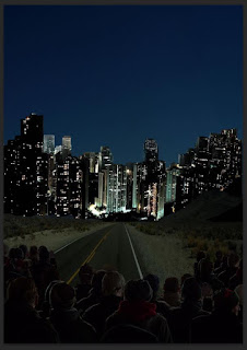
First, of course I had to add something. The basics. I used a photo of a road in a place like a desert and at the end of the road, I quick selected a city from another photograph and pasted it on top of the road photo. So far so good, but it's only the first step hahah...

Then I added a crowd a the bottom of the photo. I made the crowd way too dark, but I did not realize it at the time as I had my screen brightness all the way to 100%.

The I made the city darker. Even worse. Pardon me though, I was going for a night theme...

I made the road darker... Good Lord. You probably can't see anything... Try making your screen to its brightest, and you might be able to see what I could see at that moment. So sorry for my ignorance:(

Then I continued to make it worse by turning the sky darker...

I made some changes to the top left part of the city, but you probably cannot see any difference so... moving along to the next photo...

Here I added Angelica to the photo.

I proceeded to darken her with the burn tool. Adding highlights to her right side. I also brightened the background a little cause I finally realized that it was way to dark. I realized it through Mr. O.C., who checked on my progress and told me that it was wayyy to dark and just because it's nighttime does not mean that it has to be that dark. Then, he asked me to refer to a game called "Journey", which I searched and watched my favourite YouTuber - Pewdiepie!!! - play. I did not realize that he played that game because it came out in 2012, and back then I still did not watch YouTube as my home had no strong wifi. Whoops I went out of topic there... so back to the topic now! After Mr. O.C.'s suggestion, I made it brighter, but it still was not bright enough, which I will realize later on.

I balanced out the highlights in Angelica.

You probably can't see this but I made the sky brighter at the bottom right part to show that light came from the right part of the poster, therefore illuminating Angelica's right side.

I zoomed the entire poster in and cropped it because I realized that Angelica was too small in the other poster, so to make her the focal point and to make her more obvious, I zoomed it in.

Here, I made the right side of the buildings straight as they were slightly crooked.

I FINALLY brightened the entire thing. IT WAS ABOUT TIME. I was worried that when I print it out - because there is no adjusting the brightness of paper - that it would be too dark, so I FINALLY brightened it up. HALLELUJAH!!!!!!!

And here, I wanted to sample the title and see if it looked okay before doing the text in Illustrator.
Moving on to the texts, To Illustrator!!!

Of course I started with what I sampled in Photoshop.

I soon found out that white was much better. And I added all the other necessities.

I turned the title slightly less opaque. I like it this way, to be honest - slightly hidden behind the city, slightly see through.

Switched around with the names a little bit. Still not satisfied though. Serra's name is either wayyy too long or wayyy to short.

I finally gave up on Serra's name and swapped it with Jennie's. Perfect. Don't worry... I put Serra in the credits below. I also added the tagline on the top left of the title. And honesty time again, I liked it better there. But you gotta sacrifice sometimes, am I right?

I moved the tagline below, above the credits. And I asked the opinion of my roommate, Constance, and she said that it's better on the bottom. And now that I look at it, I like the tagline either way, so I'm not that fazed about it anymore.

I changed the font of the tagline...

Changed the tagline font again. MUCH better.

AND FINALLY... WITH - sadly, because I said that I liked the hidden, half opaque feel - OBVIOUS CHANGES TO THE TITLE... I PRESENT TO YOU.....
UNWANTED
Coming Soon to Theatres Near You.
In My Dreams.
ThankyouThankyouThankyou.
So,... Do you like it? Would YOU go and watch this movie if it ever comes out???
Cody the Bear
Adobe Illustrator: A competition presented by Paradigm Mall
While we were doing our 2 major assignments, the Greeting Cards and the Movie Poster, we had another tiny assignment, this exercise. Paradigm mall had made a competition for university and college students to create a mascot for the mall with a teddy bear template in Adobe Illustrator. The winner gets an iPhone and blahblahblah. I am not the type to be good or lucky enough to win anything, so naturally I was not interested. But, this was also a graded exercise, so I thought why not give it a try...
This is the template given by Paradigm Mall:


I proceeded to create Cody. Front and Back.
I searched up "paradigm" in Google and the meaning is "a typical example or pattern of something; a model". So I took the word "pattern" and made a sort of pattern in my creation. I made there be a Cody within a Cody within a Cody, in Cody's shirt. And as for the colour scheme, I used Paradigm Mall's logo's colour for Cody's shirts.
Here are my outcomes:


And here is the required 50 word rationale/theme for the competition:
Cody
the Bear Theme
My theme for this design is ‘Pattern’, because the
word ‘paradigm’ means ‘a typical example or pattern of something’. I made a
sort of pattern of Codys on the bear’s shirt. As for colours of the shirt, I
used the colours of Paradigm Mall’s logo.
That's all for Cody the Bear:) Thanks for sticking around until here!!! I really appreciate it:D
SEE YA!!!!!!!
No comments:
Post a Comment